My Logo, My Story
My Logo, My Story
My Logo, My Story
My Logo, My Story
A visual identity that reflects my journey—blending creativity, technology, and personal expression into one meaningful symbol.
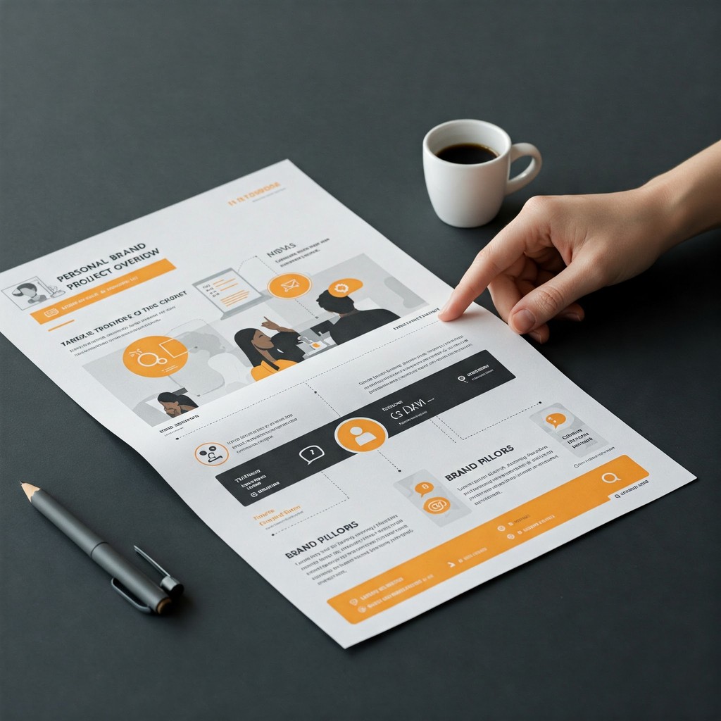
Project Overview
Project Overview
Project Overview
Project Overview
The creation of my personal logo was an exercise in balancing my identity as a designer with the values that drive my work. The design needed to reflect both my name and my professional identity, communicating my passions for creativity, technology, and precision. The final design integrates two powerful symbols: a satellite and a pen. The satellite represents my commitment to exploration, connectivity, and technology—key aspects of my work in digital design. The pen symbolizes creativity, communication, and precision, encapsulating my ability to translate ideas into clear, actionable designs. Together, these elements form a logo that not only speaks to my professional journey but also reflects my aspirations.
The creation of my personal logo was an exercise in balancing my identity as a designer with the values that drive my work. The design needed to reflect both my name and my professional identity, communicating my passions for creativity, technology, and precision. The final design integrates two powerful symbols: a satellite and a pen. The satellite represents my commitment to exploration, connectivity, and technology—key aspects of my work in digital design. The pen symbolizes creativity, communication, and precision, encapsulating my ability to translate ideas into clear, actionable designs. Together, these elements form a logo that not only speaks to my professional journey but also reflects my aspirations.
The creation of my personal logo was an exercise in balancing my identity as a designer with the values that drive my work. The design needed to reflect both my name and my professional identity, communicating my passions for creativity, technology, and precision. The final design integrates two powerful symbols: a satellite and a pen. The satellite represents my commitment to exploration, connectivity, and technology—key aspects of my work in digital design. The pen symbolizes creativity, communication, and precision, encapsulating my ability to translate ideas into clear, actionable designs. Together, these elements form a logo that not only speaks to my professional journey but also reflects my aspirations.

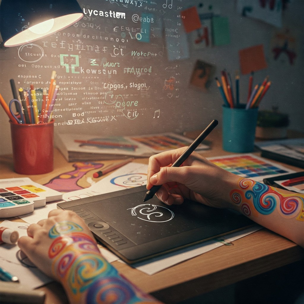
Research and Ideation:
Research and Ideation:
Research and Ideation:
In the initial phase, I focused on researching the principles of personal branding through logo design. I explored logos from industries such as technology, design, and digital innovation to understand how to visually convey personal and professional identity. This research informed the selection of symbols that would represent the core of my career: the satellite for exploration and connection, and the pen for creativity and precision. After brainstorming several variations, I sketched different arrangements of these elements, experimenting with different compositions to achieve a harmonious design. The breakthrough came when I integrated my lastname —an “N”—into the logo, bringing a personal touch to the design while ensuring visual balance and symmetry. The result was a logo that was both distinct and representative of my name and career.
In the initial phase, I focused on researching the principles of personal branding through logo design. I explored logos from industries such as technology, design, and digital innovation to understand how to visually convey personal and professional identity. This research informed the selection of symbols that would represent the core of my career: the satellite for exploration and connection, and the pen for creativity and precision. After brainstorming several variations, I sketched different arrangements of these elements, experimenting with different compositions to achieve a harmonious design. The breakthrough came when I integrated my lastname —an “N”—into the logo, bringing a personal touch to the design while ensuring visual balance and symmetry. The result was a logo that was both distinct and representative of my name and career.
In the initial phase, I focused on researching the principles of personal branding through logo design. I explored logos from industries such as technology, design, and digital innovation to understand how to visually convey personal and professional identity. This research informed the selection of symbols that would represent the core of my career: the satellite for exploration and connection, and the pen for creativity and precision. After brainstorming several variations, I sketched different arrangements of these elements, experimenting with different compositions to achieve a harmonious design. The breakthrough came when I integrated my lastname —an “N”—into the logo, bringing a personal touch to the design while ensuring visual balance and symmetry. The result was a logo that was both distinct and representative of my name and career.
Refining and Simplifying the Design
Refining and Simplifying the Design
Refining and Simplifying the Design
Once the concept was refined, I translated the sketches into a digital format using Adobe Illustrator. The focus during this phase was on simplifying the design to create something visually striking yet functional. I opted for a black-and-white color scheme, ensuring that the logo would be versatile across a range of applications, from digital interfaces to print materials. The geometric form of the “N” was designed to maintain its integrity at both large and small sizes, making it adaptable to business cards, websites, and other media. Additionally, I made sure the logo maintained a professional and timeless feel, which would resonate with potential clients and collaborators. The minimal color choice also added to the logo’s clarity and recognizability, providing a clean, sharp visual identity.
Once the concept was refined, I translated the sketches into a digital format using Adobe Illustrator. The focus during this phase was on simplifying the design to create something visually striking yet functional. I opted for a black-and-white color scheme, ensuring that the logo would be versatile across a range of applications, from digital interfaces to print materials. The geometric form of the “N” was designed to maintain its integrity at both large and small sizes, making it adaptable to business cards, websites, and other media. Additionally, I made sure the logo maintained a professional and timeless feel, which would resonate with potential clients and collaborators. The minimal color choice also added to the logo’s clarity and recognizability, providing a clean, sharp visual identity.
Once the concept was refined, I translated the sketches into a digital format using Adobe Illustrator. The focus during this phase was on simplifying the design to create something visually striking yet functional. I opted for a black-and-white color scheme, ensuring that the logo would be versatile across a range of applications, from digital interfaces to print materials. The geometric form of the “N” was designed to maintain its integrity at both large and small sizes, making it adaptable to business cards, websites, and other media. Additionally, I made sure the logo maintained a professional and timeless feel, which would resonate with potential clients and collaborators. The minimal color choice also added to the logo’s clarity and recognizability, providing a clean, sharp visual identity.

Feedback and Iteration:
Feedback and Iteration:
Feedback and Iteration:
The final stage of the process involved gathering feedback from peers and colleagues. I wanted to ensure that the logo not only captured my personal brand but also resonated with others in the design and technology sectors. The feedback process helped refine the balance between the satellite and pen, confirming that the symbols were effective in communicating my values of exploration, creativity, and precision. The collaboration allowed me to further refine the design, ensuring that it was clear, professional, and impactful. The iterative process was invaluable in confirming that the logo was both aesthetically pleasing and meaningful, aligning with my professional identity and aspirations.
The final stage of the process involved gathering feedback from peers and colleagues. I wanted to ensure that the logo not only captured my personal brand but also resonated with others in the design and technology sectors. The feedback process helped refine the balance between the satellite and pen, confirming that the symbols were effective in communicating my values of exploration, creativity, and precision. The collaboration allowed me to further refine the design, ensuring that it was clear, professional, and impactful. The iterative process was invaluable in confirming that the logo was both aesthetically pleasing and meaningful, aligning with my professional identity and aspirations.
The final stage of the process involved gathering feedback from peers and colleagues. I wanted to ensure that the logo not only captured my personal brand but also resonated with others in the design and technology sectors. The feedback process helped refine the balance between the satellite and pen, confirming that the symbols were effective in communicating my values of exploration, creativity, and precision. The collaboration allowed me to further refine the design, ensuring that it was clear, professional, and impactful. The iterative process was invaluable in confirming that the logo was both aesthetically pleasing and meaningful, aligning with my professional identity and aspirations.
Would love to hear your feedback!
Would love to hear your feedback!