Case Study:
Improving Account Removing Process in Demo Outlook
Case Study:
Improving Account Removing Process in Demo Outlook
Case Study:
Improving Account Removing Process in Demo Outlook
Case Study:
Improving Account Removing Process in Demo Outlook
A UX Case Study by Satellite Nongmaithem
Introduction
Introduction
Introduction
Introduction
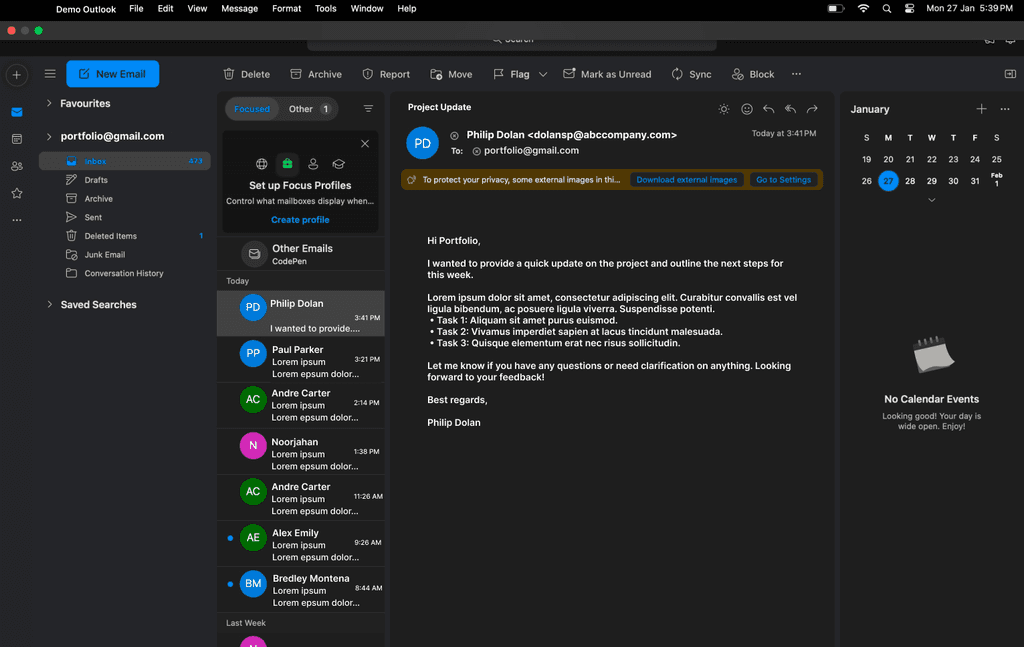
This case study focuses on improving the account-switching experience in Demo Outlook—a fictional version of Microsoft Outlook. This is a personal educational project and is not affiliated with Microsoft.
The project addresses a real problem: many users struggle to remove accounts in Outlook due to an unintuitive interface. Instead of completing this simple action effortlessly, users often become frustrated and search for online tutorials to find a solution. The existing process disrupts productivity and does not align with common UX patterns found in other applications.
By applying a structured UX process—User Research, Problem Definition, Ideation, Design, Prototyping, Testing, and Iteration—this project explores a more seamless solution for account removing process.
This case study focuses on improving the account-switching experience in Demo Outlook—a fictional version of Microsoft Outlook app for macbook users. This is a personal educational project and is not affiliated with Microsoft.
The project addresses a real problem: many users struggle to remove accounts in Outlook due to an unintuitive interface. Instead of completing this simple action effortlessly, users often become frustrated and search for online tutorials to find a solution. The existing process disrupts productivity and does not align with common UX patterns found in other applications.
By applying a structured UX process—User Research, Problem Definition, Ideation, Design, Prototyping, Testing, and Iteration—this project explores a more seamless solution for account removing process.

Research Phase
Research Phase
Research Phase
Research Phase
User Interviews
User Interviews
User Interviews
User Interviews
To understand real user struggles, I conducted one-on-one interviews with 15-20 classmates, all of whom are regular Outlook users. Each participant was asked to attempt switching accounts while thinking out loud.
Best Practices Followed in UX Interviews
Contextual Observation: Users were asked to switch accounts without prior guidance to observe their natural behaviors.
Think-Aloud Method: Participants verbalized their thought process, helping uncover pain points.
Follow-up Questions: Asked about their expectations and how they would typically switch accounts in other apps.
Non-leading Questions: Ensured neutrality to avoid influencing user responses.
To understand real user struggles, I conducted one-on-one interviews with 20 classmates, all of whom are regular Outlook users. Each participant was asked to attempt Remove accounts while thinking out loud.
Best Practices Followed in UX Interviews
Contextual Observation: Users were asked to remove accounts without prior guidance to observe their natural behaviors.
Think-Aloud Method: Participants verbalized their thought process, helping uncover pain points.
Follow-up Questions: Asked about their expectations and how they would typically remove accounts in other apps.
Non-leading Questions: Ensured neutrality to avoid influencing user responses.

User Interviews
To understand real user struggles, I conducted one-on-one interviews with 15-20 classmates, all of whom are regular Outlook users. Each participant was asked to attempt switching accounts while thinking out loud.
Best Practices Followed in UX Interviews
Contextual Observation: Users were asked to switch accounts without prior guidance to observe their natural behaviors.
Think-Aloud Method: Participants verbalized their thought process, helping uncover pain points.
Follow-up Questions: Asked about their expectations and how they would typically switch accounts in other apps.
Non-leading Questions: Ensured neutrality to avoid influencing user responses.
Key Findings & Common Patterns
Key Findings & Common Patterns
Key Findings & Common Patterns
Key Findings & Common Patterns
Users exhibited similar unsuccessful patterns when trying to remove accounts :
Users exhibited similar unsuccessful patterns when trying to remove accounts :
Users exhibited similar unsuccessful patterns when trying to remove accounts :

1.Looking for a Logout Option
1.Looking for a Logout Option
1.Looking for a Logout Option
1.Looking for a Logout Option
Many first tapped the three-dot menu on the left, expecting to find a logout or remove account option, but it only contained unrelated features like “To-Do” and “Notes.”
Many first tapped the three-dot menu on the left, expecting to find a logout or remove account option, but it only contained unrelated features like “To-Do” and “Notes.”
Many first tapped the three-dot menu on the left, expecting to find a logout or remove account option, but it only contained unrelated features like “To-Do” and “Notes.”

2.Clicking on the Email Address
2.Clicking on the Email Address
2.Clicking on the Email Address
2.Clicking on the Email Address
Some tried clicking on their email address displayed in the sidebar, assuming it would open an account-removing menu. Instead, it showed folders like Inbox, Sent, and Deleted, increasing confusion.
Some tried clicking on their email address displayed in the sidebar, assuming it would open an account-removing menu. Instead, it showed folders like Inbox, Sent, and Deleted, increasing confusion.
Some tried clicking on their email address displayed in the sidebar, assuming it would open an account-removing menu. Instead, it showed folders like Inbox, Sent, and Deleted, increasing confusion.
3.Trying the Top-Right Icon
3.Trying the Top-Right Icon
3.Trying the Top-Right Icon
3.Trying the Top-Right Icon
Users noticed an icon in the top-right corner that resembled a logout button. However, tapping it opened the “Calendar” and “What’s New” panel, which further frustrated them.
Users noticed an icon in the top-right corner that resembled a logout button. However, tapping it opened the “Calendar” and “What’s New” panel, which further frustrated them.
Users noticed an icon in the top-right corner that resembled a logout button. However, tapping it opened the “Calendar” and “What’s New” panel, which further frustrated them.
4.Exploring the Top Navigation Bar
4.Exploring the Top Navigation Bar
4.Exploring the Top Navigation Bar
4.Exploring the Top Navigation Bar
Others checked the File, Edit, and View menus in the top navigation bar. They found the account settings but struggled to log out or remove accounts, as the UI did not follow familiar mental models.
Others checked the File, Edit, and View menus in the top navigation bar. They found the account settings but struggled to log out or remove accounts, as the UI did not follow familiar mental models.
Others checked the File, Edit, and View menus in the top navigation bar. They found the account settings but struggled to log out or remove accounts, as the UI did not follow familiar mental models.

5.Seeking External Help
5.Seeking External Help
5.Seeking External Help
5.Seeking External Help
Many users, unable to find a solution, resorted to searching online tutorials or YouTube videos to figure out how to remove accounts.
Many users, unable to find a solution, resorted to searching online tutorials or YouTube videos to figure out how to remove accounts.
Many users, unable to find a solution, resorted to searching online tutorials or YouTube videos to figure out how to remove accounts.
Competetion Analysis
Competetion Analysis
Competetion Analysis
Competetion Analysis
To understand best practices, I conducted a comparative analysis with other email platforms:
To understand best practices, I conducted a comparative analysis with other email platforms:

Gmail
Gmail
Gmail
Provides a one-tap account log-out option via the profile icon, making transitions between accounts quick and intuitive. The clear visual hierarchy and persistent account indicators reduce confusion. However, some users find switching between Google accounts across services (e.g., Drive, YouTube) inconsistent.
Provides a one-tap account log-out option via the profile icon, making transitions between accounts quick and intuitive. The clear visual hierarchy and persistent account indicators reduce confusion. However, some users find switching between Google accounts across services (e.g., Drive, YouTube) inconsistent.

Apple Mail
Apple Mail
Apple Mail
Offers a seamless account-removing experience with a persistent sidebar listing all accounts, allowing users to switch effortlessly without navigating through multiple menus. However, customization options are limited, and account settings are somewhat buried.
Offers a seamless account-removing experience with a persistent sidebar listing all accounts, allowing users to switch effortlessly without navigating through multiple menus. However, customization options are limited, and account settings are somewhat buried.
Problem Statement
Problem Statement
Problem Statement
Problem Statement
Users of Demo Outlook struggle to locate the account-removing option due to unclear navigation and poor visibility of logout and remove account functions. Many expect to find these options in familiar locations, such as the three-dot menu, email display, or top-right icon, but instead encounter unrelated features, leading to frustration and wasted time. As a result, users often resort to searching online tutorials or trial and error, which disrupts their workflow and increases cognitive load. This inefficiency makes a simple task unnecessarily complex, affecting productivity and overall user satisfaction.
Users of Demo Outlook struggle to locate the account-removing option due to unclear navigation and poor visibility of logout and remove account functions. Many expect to find these options in familiar locations, such as the three-dot menu, email display, or top-right icon, but instead encounter unrelated features, leading to frustration and wasted time. As a result, users often resort to searching online tutorials or trial and error, which disrupts their workflow and increases cognitive load. This inefficiency makes a simple task unnecessarily complex, affecting productivity and overall user satisfaction.
Ideation Phase
Ideation Phase
Ideation Phase
Ideation Phase
To address these issues, I brainstormed potential solutions:
Redesign the Remove/Log-out UI for better visibility.
Make account removing process more intuitive with a quick-access menu.
Simplify the account settings layout for easier navigation.
To address these issues, I brainstormed potential solutions:
Redesign the Remove/Log-out UI for better visibility.
Make account removing process more intuitive with a quick-access menu.
Simplify the account settings layout for easier navigation.
Proposed Solution
Proposed Solution
Proposed Solution
Proposed Solution
User research revealed that most users instinctively click on their profile icon to remove accounts, following a familiar mental model seen in other email clients. However, Demo Outlook lacks a clear, intuitive option in this location. To align with user expectations and reduce frustration, a dedicated “Remove Account ” option will be placed prominently within the profile dropdown menu, ensuring seamless and efficient account transitions.
User research revealed that most users instinctively click on their profile icon to remove accounts, following a familiar mental model seen in other email clients. However, Demo Outlook lacks a clear, intuitive option in this location. To align with user expectations and reduce frustration, a dedicated “Remove Account ” option will be placed prominently within the profile dropdown menu, ensuring seamless and efficient account transitions.

Wireframing & UI Adjustments
Wireframing & UI Adjustments
Wireframing & UI Adjustments
Wireframing & UI Adjustments
Based on research insights, I created low-fidelity wireframes and refined them into high-fidelity mockups while maintaining consistency with Demo Outlook’s existing design.
Based on research insights, I created low-fidelity wireframes and refined them into high-fidelity mockups while maintaining consistency with Demo Outlook’s existing design.
Based on research insights, I created low-fidelity wireframes and refined them into high-fidelity mockups while maintaining consistency with Demo Outlook’s existing design.
Key Design Changes
Key Design Changes
Key Design Changes
Key Design Changes
Profile Icon as the Primary Access Point
Clicking on the user’s email or profile icon now directly opens an removing menu.
Clear “Remove Account Option"
No need to navigate deep into settings—users see all account-related actions in one place.
Enhanced Visibility & Clear Labels.
Previously unclear remove button is now visually distinct and easily accessible.
Testing & Iteration
To validate the new design, I conducted usability testing with 10 Outlook users
Results
Results
Results
Results
100% of participants successfully switched accounts on the first attempt.
Task completion time reduced from several minutes to just a few seconds.
No need for external tutorials—users intuitively found the account-switching option.
100% of participants successfully switched accounts on the first attempt.
Task completion time reduced from several minutes to just a few seconds.
No need for external tutorials—users intuitively found the account-switching option.
100% of participants successfully switched accounts on the first attempt.
Task completion time reduced from several minutes to just a few seconds.
No need for external tutorials—users intuitively found the account-switching option.

User Reviews
User Reviews
User Reviews
User Reviews

Kuko Yukio
Koku Yukio
Yuk009@algonquinlive.com
“This is exactly where I expected the account switcher to be.”
“This is exactly where I expected the account switcher to be.”

Tokyo Kolom
kolo003@algonquinlive.com
“I don’t need to dig through menus anymore—so much faster!”
“I don’t need to dig through menus anymore—so much faster!”

Paul
pau007@algonquinlive.com
“The logout or account removing process option is finally visible and accessible.”
Iteration & Final Improvements
Iteration & Final Improvements
Iteration & Final Improvements
Iteration & Final Improvements
“After gathering feedback from users, I was informed that no further refinements were necessary, as the design was smooth and ready to move forward.”
“After gathering feedback from users, I was informed that no further refinements were necessary, as the design was smooth and ready to move forward.”
Key Takeaways
Key Takeaways
Key Takeaways
Key Takeaways
User research revealed common pain points and validated the problem
Competitive analysis informed best design practices
Prototyping & testing ensured a truly user-friendly solution.
User research revealed common pain points and validated the problem
Competitive analysis informed best design practices
Prototyping & testing ensured a truly user-friendly solution.
Conclusion
Conclusion
Conclusion
Conclusion
100% of participants successfully removed accounts on the first attempt.
Task completion time reduced from several minutes to just a few seconds.
No need for external tutorials—users intuitively found the account-removing option.
100% of participants successfully removed accounts on the first attempt.
Task completion time reduced from several minutes to just a few seconds.
No need for external tutorials—users intuitively found the account-removing option.
100% of participants successfully removed accounts on the first attempt.
Task completion time reduced from several minutes to just a few seconds.
No need for external tutorials—users intuitively found the account-removing option.

Would love to hear your feedback!
Would love to hear your feedback!